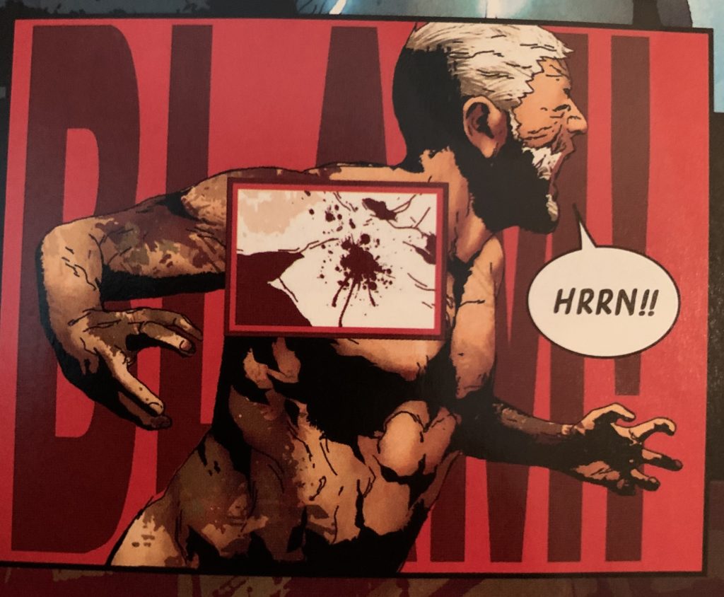
Most of the camera roll on my phone is either dead animals I find out in the world, trucks I cruise real slow by in parking lots, or comic panels I want to keep close forever. Here’s the latest, from Old Man Logan, by Andrea Sorrentino and Jeff Lemire:

The layers of this moment, right? This is Logan getting shot, which is a very kinetic story moment, but of course comic book panels aren’t animated gifs, they’re static, so the artist has to suggest ‘motion’ in other ways. Like, say, by making the SFX a) big, and b) the backdrop — which, note, as backdrop, this “BLAM!” isn’t even completely readable, because who has time to read when the bullets are flying? Certainly not Logan. And this panel, it’s all about his POV, it feels like: this “BLAM!” is filling HIS head, and we’re seeing the visual approximation of that.
The next layer up, closer to us, is of course Logan, awkwardly-positioned — catching a bullet ain’t easy, it twists you up — but what to pay attention to here are his fingers, I think. They’re Emily Rose’d up, all cranked back and contorted with pain, and Logan’s mouth is open, is bursting out the NEXT layer, which is that speech ballon, that “HRRN!!” — an inarticulate, close-eyed grunt in all-caps, with DOUBLE-punctuation, and, importantly, a lot of white space between the lettering and the balloon borders, which serves to re-establish how alone Logan is not just in the panel, but this story: he’s been tossed back in time to a different universe, and everything he says to anybody here might as well be “HRRN!!” for all they can understand him.
Too, this panel doesn’t feel designed FOR a balloon, really, does it? Some artists, you can kind of tell they’re leaving some empty room for people to speak. Not so here. Yet that balloon is completely organic, too. Note how its tail is angled UP to Logan’s mouth, which is to say this burst of ‘speech’ is coming DOWN from his mouth. Why? Because he’s being shot in the shoulder, and so, just from the impact, is of course curling around that hot ball of pain, which then necessitates that any dialogue or grunt or exhalation he can muster at the time, it’s going to come DOWN out of his mouth. This speech balloon could ONLY have been EXACTLY where it is.
And then that wonderful centerpiece of this panel, that inset that highlights the actual bullet splashing into Logan’s actual shoulder. This isn’t one of those magnifying-lens insets you see sometime, that are kind of Chris Ware-diagrammatic, but a lens that strips out the color, and, importantly, very importantly, it perfectly matches the color of that backdrop SFX, which serves to draw all these stacked layers into a single moment, while still drawing our eye to this square “mini-panel” of impact, as if WE’RE the bullet, boring at high velocity into Logan’s shoulder, into this freeze-framed but highly active hundredth of a second which we can now hear and feel, but all through a strictly visual medium. And the double frame AROUND that inset makes it feel either like we’re telescoping in, or that this impact is rising to meet us — beveling the edge like this is the right border, for sure.
With comic book art — well, with comic books in general, I tend to think of some as by cartoonists (Spiegelman, Bechdel), and some as by illustrators (Gibbons, Ross), with the divide there being not so much style or effect, I’m not talking ‘realism’ versus ‘caricature’ or anything, but . . . my take is that cartoonists are better at distillation and expression, while illustrators are better with actual representation. And, if I have to pick, I’ll go with the cartoonists every time. Give me Cerebus, please. Of course, here, the distinction I’m reaching for could actually be more ‘auteur’ and ‘work for hire,’ meaning just that the comic book artists I’m calling illustrators are generally working off someone else’s script, while cartoonists often have that script in their own head and heart already, are a one-person operation (even including lettering and coloring, sometimes — though, as with Sims, not always the backdrops . . . ). However, panels like this one from Old Man Logan, and of course some of the stuff you’ll see David Aja pull off . . . I don’t know, man. These panels whisper to me that my distinction between cartoonists and illustrators is a false one. Sorrentino, here, with layout, is achieving that same expressiveness that the McCloud-ish cartoonists of the world have that instinct for. And it’s just not just limited to single panels, either. Given space, some of these artists pull stuff like this off on the whole page, across a whole issue, a whole series.
Anyway, just wanted to give a walkthrough of how I read comic books, I suppose. It’s always a slow process, because I study, I pore, I reconsider. Comic books aren’t just storyboarded movies, they’re not just illustrated scripts. When the form’s really working, the words and art and colors and layouts coalesce into something hard to finally articulate, but completely tangible all the same.


